The Infatuation, San Francisco
UX/UI Design / Research / Wireframing / Prototyping
The Infatuation, San Francisco
UX/UI Design / Research / Wireframing / Prototyping
Guerilla Advertising
Guerilla Advertising
Saddle Stage Drive-In Concerts
Saddle Stage Drive-In Concerts
Saddle Stage Drive-In Concerts
Saddle Stage Drive-In Concerts
Saddle Stage Drive-In Concerts
Resume
Contact
Duration: Two Weeks
Role: Sketching / Personas / Hi & Lo Fidelity / Wireframes / Prototyping
The Infatuation is both a website and a mobile application that revolves around the idea of providing personable guides and unique experiences for users who want to explore their major city. Its "Perfect For" and "Guides" make The Infatuation a more engaging experience, which is why it is a very up and coming website for users who enjoy going out to not just restaurants but cafes, bakeries, bars, breweries, and more.
Background

Added feature to support a
more personalized experience.
The Infatuation
Problem
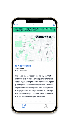
Here you can see the current state of The Infatuation app. Though The Infatuation is a well developed site and brand overall, their mobile app is lacking in many of its unique aspects such as their "Perfect For", "Cuisines", and "Neighborhoods" drop downs. We found that the app was very bare and did not offer nearly enough features as other competing apps such as opentable and yelp. Because the app is so minimal in its offerings, it makes the user reluctant to use it. We not only wanted to add back these features, but additionally add a more personalized experience for the user.


Research

In order to have a better understanding of the pain points and needs of users, we conducted around 15 user interviews. Those included in these interviews were both users of The Infatuation or users of other restaurant suggestion apps. After collecting information from these interviews, we were then able to organize them into an affinity map.
User Interviews
-
" I look to go to restaurants that offer a unique experience and have a cool atmosphere"
-
"I prefer to know the distance away places are from me because I do not like to travel far often"
-
"I read reviews to decide if I will go to a restaurant"
-
"I currently either use an app to discover new restaurants or I hear about them through recommendations of friends"
-
"I enjoy trying new restaurants and unique cuisine"
Affinity Mapping Takeaways
After analyzing our affinity map and understanding the behaviors of our user interviews, we were able to begin the process of defining our primary persona. We found that a large number of our interviewees liked going out frequently; whether that be to a dinner restaurant, a cafe, a bar etc. We additionally found that a lot of these people are fairly particular with how and when they go out. With this information we were able to develop our primary persona, Sierra.
Defining Our User

Ideation


Sketching & Wireframing
Each member of our team came up with a set of sketches for how our screens would look with the few added features to the app. After heavy discussion and alteration, we were able to successfully agreed upon sketches that we were then able to collectively form into low fidelity wireframes. After the user research and initial study of the app, we decided a main goal was to make this a very personalized experience for our user. There were then three things we knew wanted to add / include in the app:
1) A filter option with filters consisting of neighborhood, cuisine, distance, price, and reviews
2) Adding a "Perfect For" tab in the center of the main feed containing relevant restaurants, bars, cafes. etc.
3) Having a pop up as the first page as a call to action to introduce the new feature to the users.

After our creation of our first low fidelity version, we were each able to conduct two usablity testing, giving us six rounds of feedback. I tested the first version of the prototype with 5 users to determine the necessary revisions to make the overall experience more intuitive and pleasant. Here are some outtakes.
-
Users had trouble using thee filters icon; it seemed secondary and not like a feature that would successfully direct them to a desired restaurant .
Fix: Move the filters icon to a more prominent spot on the screen where it is bold and an obvious main feature. -
Users immediately wanted to use the search button
Fix: Remove the search feature; the app revolves around using preferences and filters to find a desired dining spot. Additionally, the website does not have a search feature. -
Users were making it to the final page with the location but were confused as to why there was not an extra step to inform the user of their specific directions in making it to that desired location.
Fix: We added an extra page that was dedicated to specific directions from the users location to the spot they are looking to get to.
Low Fidelity Usability Testing
Delivery


High Fidelity Wireframes
Our high fidelity wireframes are a result of many changes and alterations due to our feedback in our first round usability testing. Here we were able to implement The Infatuation's brand integrity into the app and really make the features look natural. As a result of further critique we were able to alter our filters in order to include the already applied filters so that the user has a sense in the filters they chose. Previously we had no indication of that, which left the user confused after applying more than one filter.
Prototype
What's Next?
There's always room for improvement. Especially when you're like me and are always itching to get a better version of any sort of creation. Though we did a good job in adding filters and categories, there is a lot we could still expand.
In a majority of our user interviews we noticed users wanting to use the "SF" pin icon, meaning their first instinct was to use the map to search for places. I think that would be a great addition to this app. This way we could further develop the the features in efforts to make it more convenient for users.
We additionally found that a lot of our users preferred specific cuisines and on top of that had some dietary restrictions; if we added a menu / linked a menu for each restaurant, that would add an extra important piece of information that would benefit our users.
I lastly think that our filters could be added to as well. With more user research and continual testing, we will have a better idea of what our users look for when sorting through restaurants and what specifically they want when they dine out. In general, our main goal in this project was to make this application feel like more of a personable experience for the user, so adding features to enhance that will continue to push its functionality and purpose.
